Client / Brand reference
Presentation created by
Visual concept, design page & motion test presentation
Ogilvy brief • Neo Fiber • May 2026
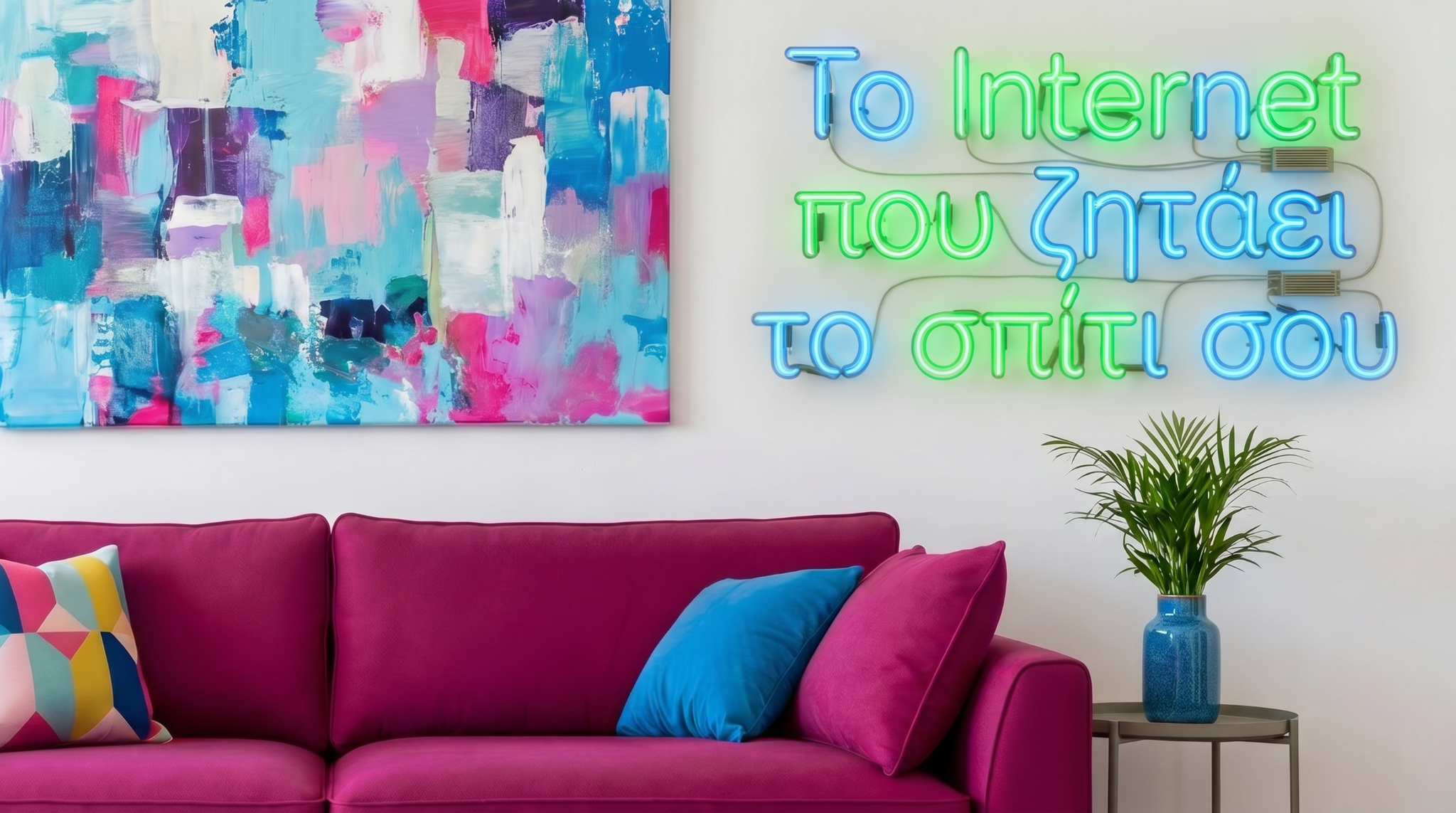
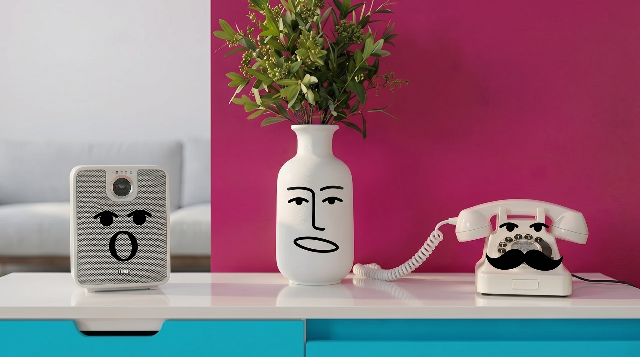
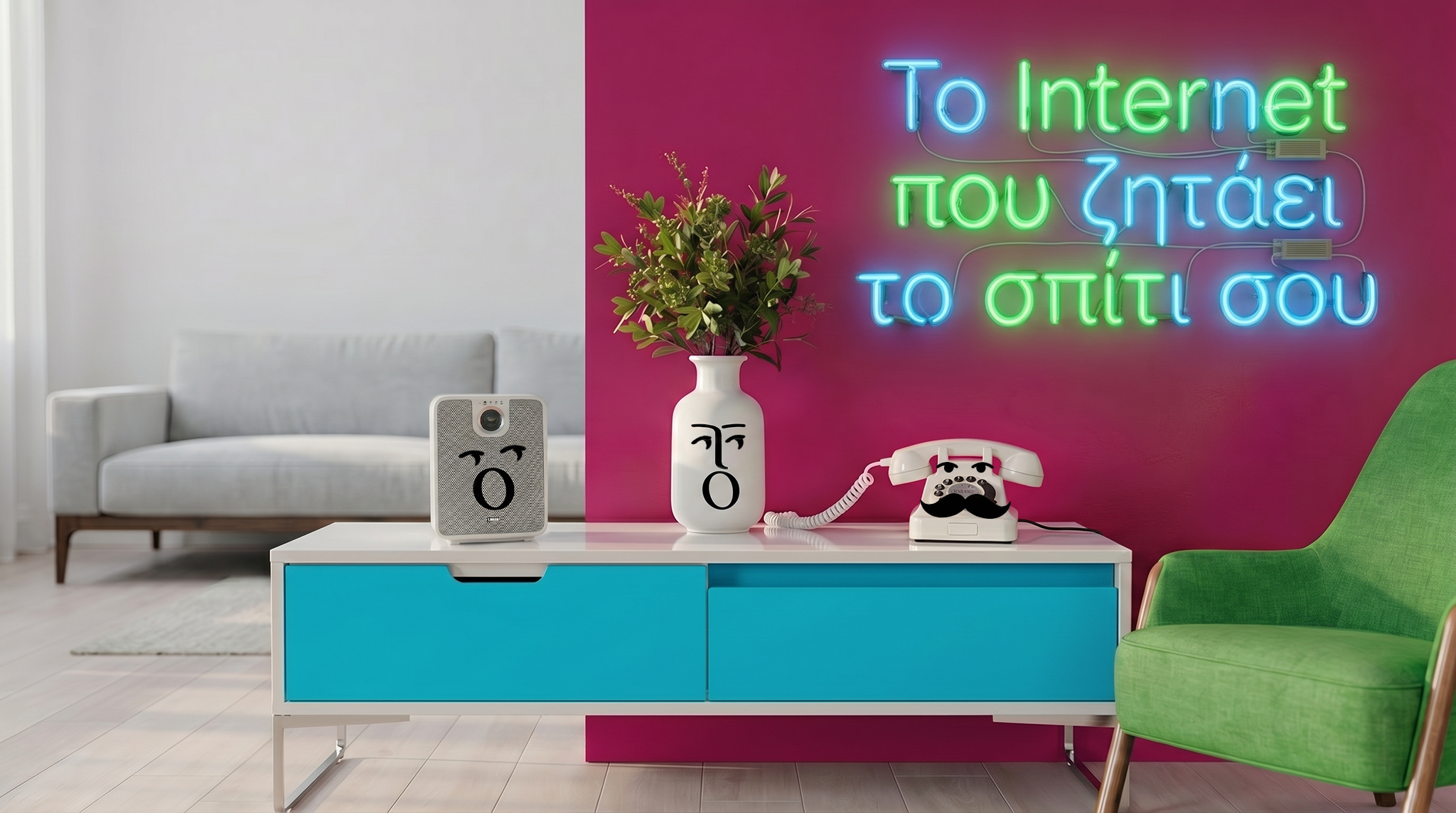
Presenting a visual world where the home itself speaks.
This presentation page introduces the proposed design direction for the Neo Fiber world: real domestic spaces, anthropomorphic home objects, and an environment shaped directly by the brand palette. The goal is to translate the brief’s core thought — “Το internet που ζητάει το σπίτι σου” — into a clear, premium and memorable visual language.
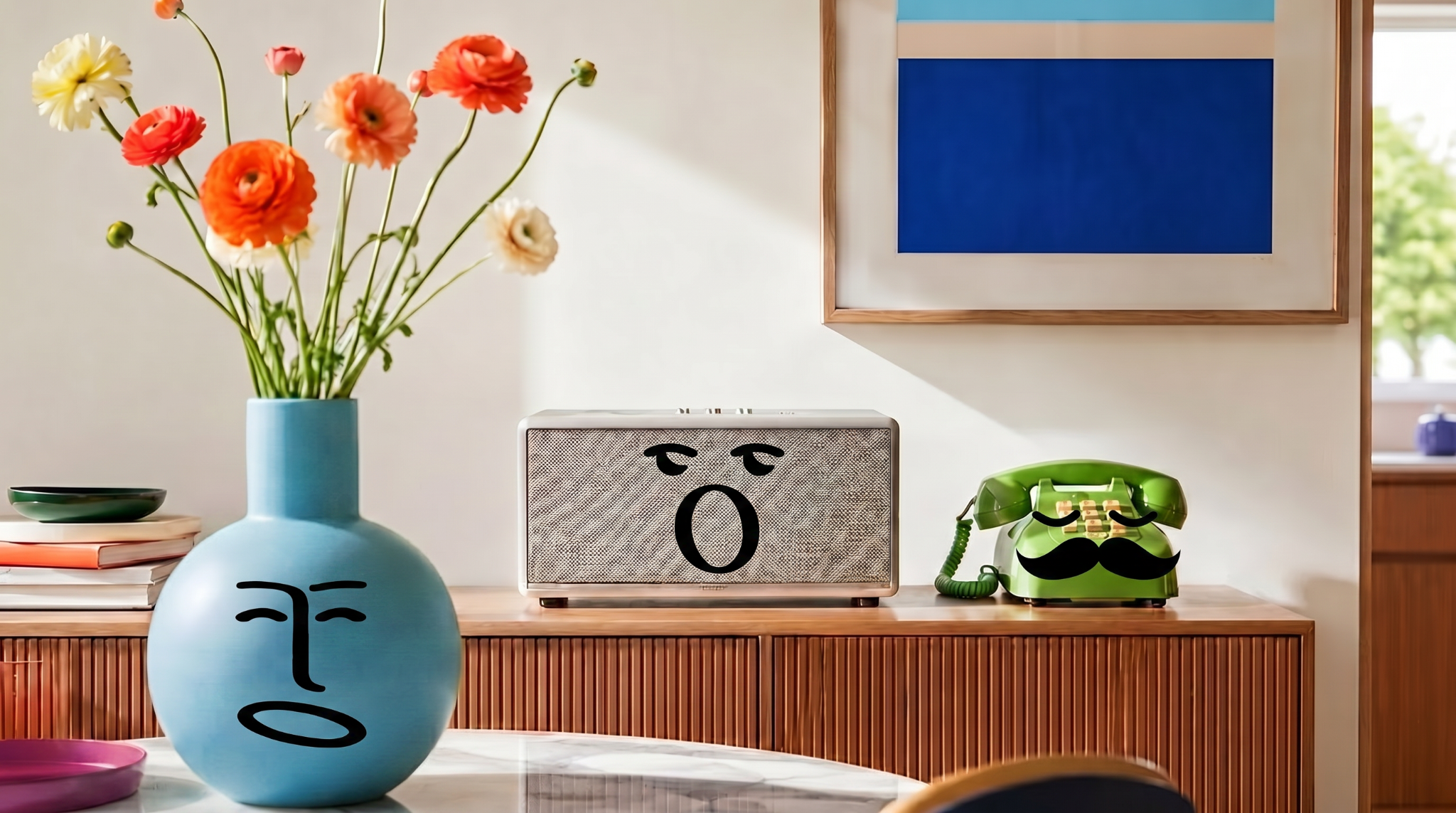
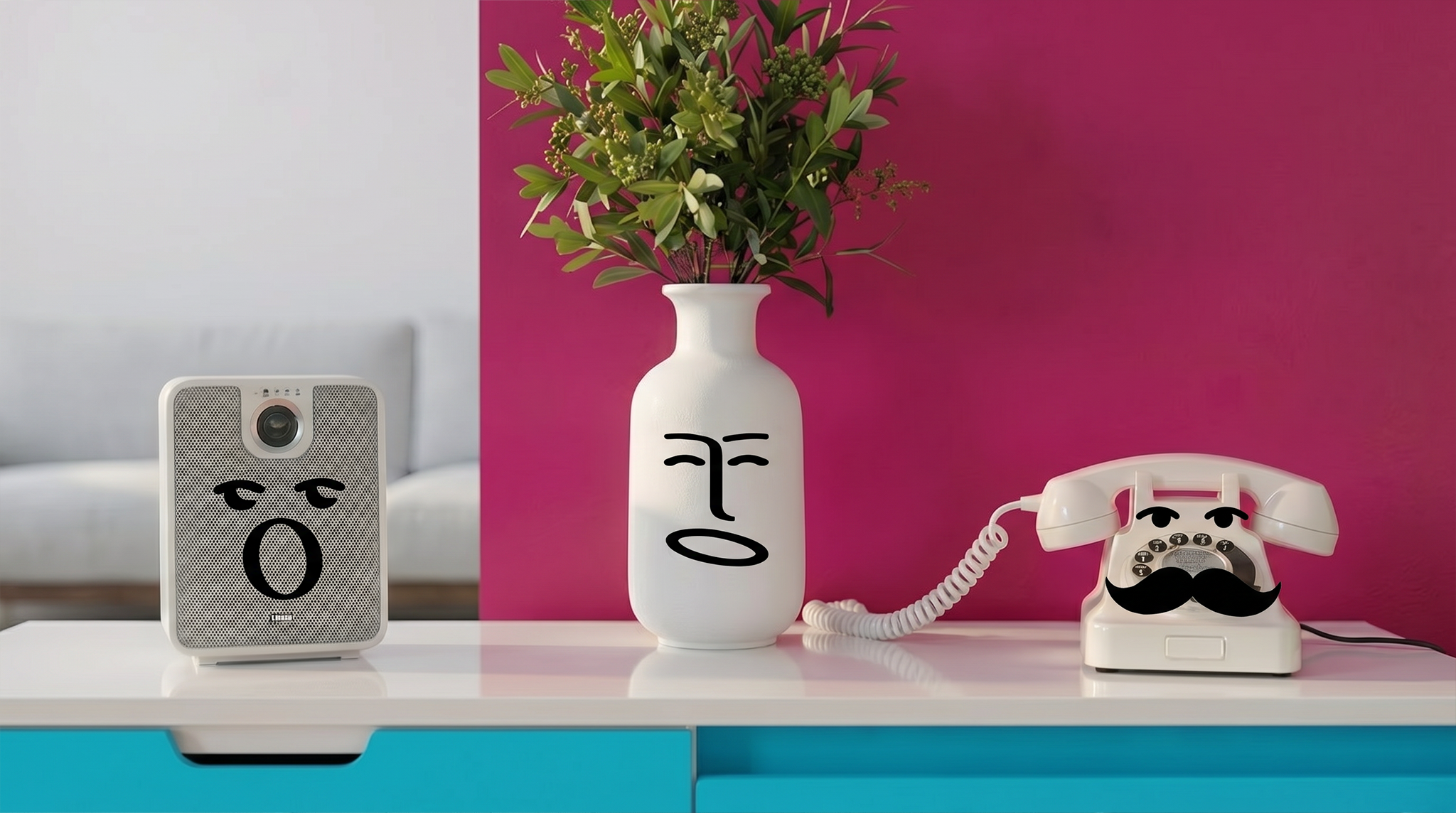
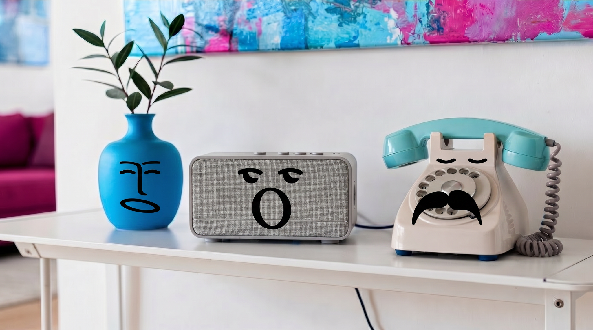
Photoreal spaces
2D minimal faces
Brand-led interiors
Neo Fiber color integration
2Animation test videos to compare two different 2D facial animation treatments.
6Still visual explorations showing the characters and the home environment direction.
1Unified design language grounded in the official Neo Fiber palette and brand tone.